
Test how your website looks on different devices – instantly and for free. Use our responsive website testing tool to check if your site is mobile-friendly and performs well on desktops, tablets, and smartphones.
Why Responsive Testing Matters
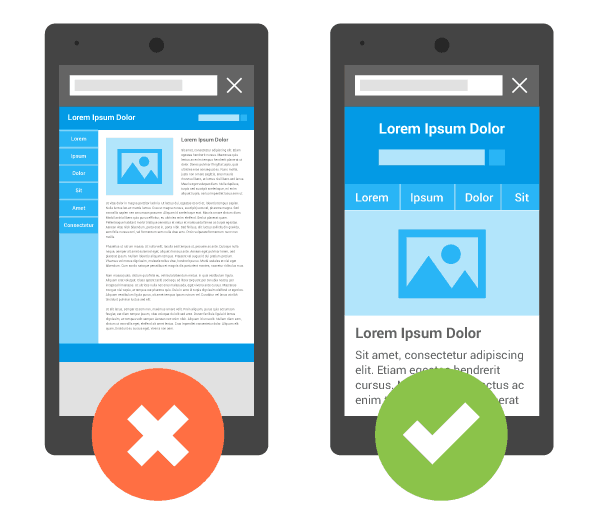
In today’s mobile-first world, your website must look and function properly across all screen sizes. A responsive design not only improves user experience but also helps with SEO and conversions.
This tool lets you:
Preview your website on mobile, tablet, and desktop views
Spot layout issues before they affect real users
Test website responsiveness directly in your browser – no extensions needed
Who Should Use This Tool?
- Web designers and developers
- Business owners checking their site layout
- Ecommerce store managers
- Students or freelancers testing project responsiveness
- Agencies handling client websites
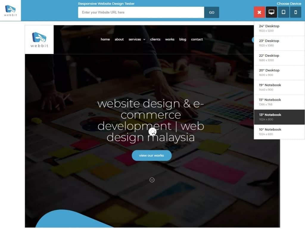
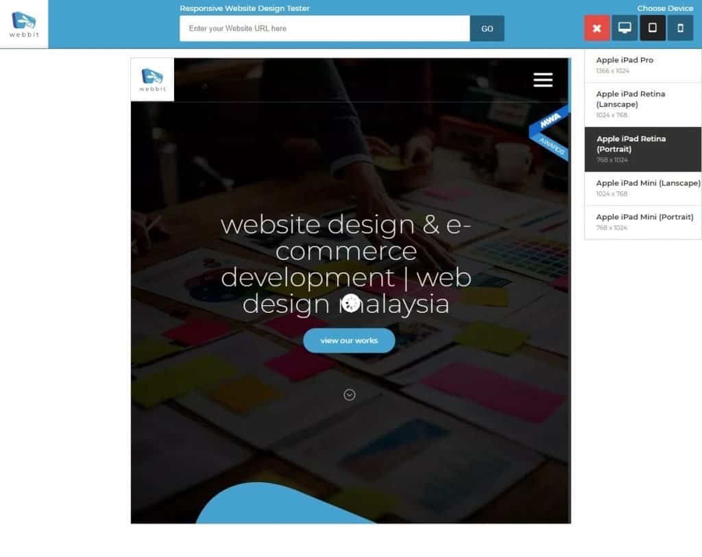
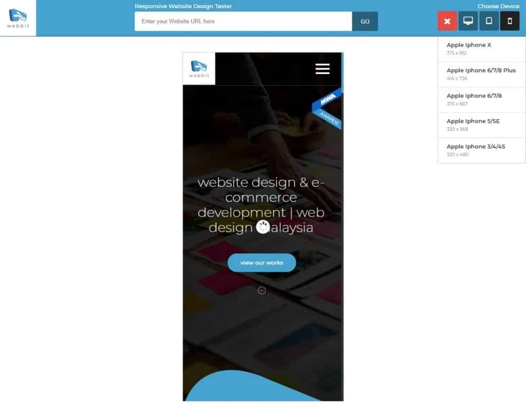
Here’s what webbit site looks like on different view:
Desktop View
Tablet View
Mobile View
Built for Malaysian Website Owners
At Webbit, we provide tools and services to help Malaysian businesses grow online. Whether you’re building a new site or maintaining an existing one, this tool helps you ensure your website looks good everywhere.
Need help building a truly responsive site?
We offer:
Our team is ready to help you design or fix your website, so it looks great on any screen.
Need a Custom Website That Works Everywhere?
We don’t just test websites — we build them to perform. If you want a fast, mobile-friendly website designed for results, get in touch with our team today.
Contact Us to book a free consultation.